Info kplace.plala.jpから移設しました
Web/Topページ
作成日: 2017/01/14■目的
Web/TopページをBootstrapでResponsiveにします。サイトイメージを再配置し提供された各要素を利用するとスマホ対応になります。
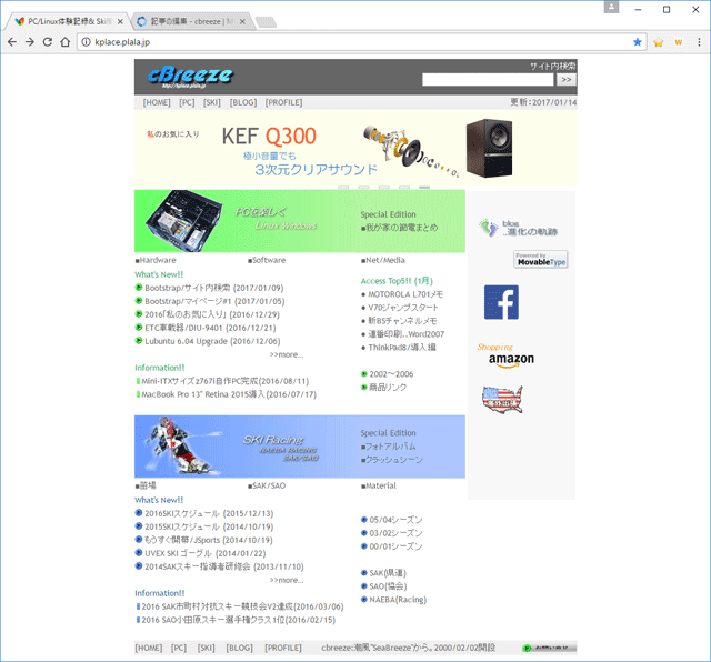
■元イメージ
Width=700pxの固定幅の元のサイトイメージです。スマホだと横方向にはみ出します。
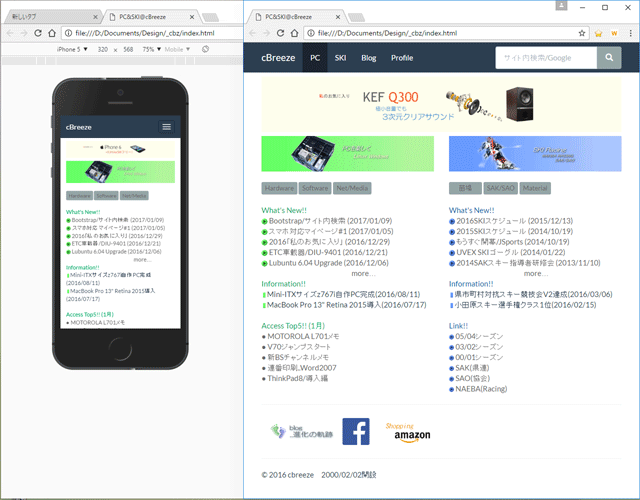
■Responsive
Bootstrap+Bootswatch/Flatyベースで作成したTopページになります。サイトイメージを再配置し、提供された構成要素をコピー/ペーストで利用してResponsive対応にします。
・Navbar+サイト内Google検索
・Slide Show
・Grid System
■Code
(1)ページ最大幅
Bootstrapのデフォルトはmax-width=1200pxで大きすぎて違和感があります。
custom-template.cssを作成してコンテナ幅を750pxに変更します。
またNavbarとタイトルの重複を回避します。
/* Customize container */
@media (min-width: 768px) {
.container {
max-width: 750px;
}
}
/* Customize body */
body {
padding-top: 70px;
}
(2)Navbarとサイト内Google検索@media (min-width: 768px) {
.container {
max-width: 750px;
}
}
/* Customize body */
body {
padding-top: 70px;
}
上部に固定のNavbar内にGoogleカスタム検索を用いたサイト内検索のformを追加します。
<nav class="navbar navbar-default
navbar-fixed-top">
<div class="container">
<!-- Brand and toggle get grouped for better mobile display -->
<div class="navbar-header"> <button type="button" class="navbar-toggle collapsed"
data-toggle="collapse" data-target="#bs-example-navbar-collapse-1"
aria-expanded="false"> <span class="sr-only">Toggle navigation</span>
<span class="icon-bar"></span> <span class="icon-bar"></span> <span
class="icon-bar"></span> </button> <a class="navbar-brand" href="#">cBreeze</a>
</div>
<!-- Collect the nav links, forms, and other content for toggling -->
<div class="collapse navbar-collapse" id="bs-example-navbar-collapse-1">
<ul class="nav navbar-nav">
<li class="active"><a href="#">PC <span class="sr-only">(current)</span></a></li>
<li><a href="#">SKI</a></li>
<li><a href="#">Blog</a></li>
<li><a href="#">Profile</a></li>
</ul>
<form class="navbar-form navbar-right" role="search" action="https://www.google.com/cse"
id="cse-search-box">
<div class="input-group">
<input name="q" class="form-control" placeholder="サイト内検索/Google" type="text">
<input name="cx" value="017464931460357357541:0coahs0nnfo" type="hidden">
<span class="input-group-btn"> <button type="submit" class="btn btn-default">
<span class="glyphicon glyphicon-search"></span>
</button> </span> </div>
</form>
</div><!-- /.navbar-collapse -->
</div><!-- /.container -->
</nav>
(3)Slide<div class="container">
<!-- Brand and toggle get grouped for better mobile display -->
<div class="navbar-header"> <button type="button" class="navbar-toggle collapsed"
data-toggle="collapse" data-target="#bs-example-navbar-collapse-1"
aria-expanded="false"> <span class="sr-only">Toggle navigation</span>
<span class="icon-bar"></span> <span class="icon-bar"></span> <span
class="icon-bar"></span> </button> <a class="navbar-brand" href="#">cBreeze</a>
</div>
<!-- Collect the nav links, forms, and other content for toggling -->
<div class="collapse navbar-collapse" id="bs-example-navbar-collapse-1">
<ul class="nav navbar-nav">
<li class="active"><a href="#">PC <span class="sr-only">(current)</span></a></li>
<li><a href="#">SKI</a></li>
<li><a href="#">Blog</a></li>
<li><a href="#">Profile</a></li>
</ul>
<form class="navbar-form navbar-right" role="search" action="https://www.google.com/cse"
id="cse-search-box">
<div class="input-group">
<input name="q" class="form-control" placeholder="サイト内検索/Google" type="text">
<input name="cx" value="017464931460357357541:0coahs0nnfo" type="hidden">
<span class="input-group-btn"> <button type="submit" class="btn btn-default">
<span class="glyphicon glyphicon-search"></span>
</button> </span> </div>
</form>
</div><!-- /.navbar-collapse -->
</div><!-- /.container -->
</nav>
jQueryからW3schoolsのScriptを利用したスライドショウに変更しました。
[html]
<div class="w3-content w3-section">
<img class="mySlides w3-animate-right" src="./image2/slide008n.png" style="width:100%">
<img class="mySlides w3-animate-right" src="./image2/slide010n.png" style="width:100%">
<img class="mySlides w3-animate-right" src="./image2/slide004n.png" style="width:100%">
</div>
[Script]<img class="mySlides w3-animate-right" src="./image2/slide008n.png" style="width:100%">
<img class="mySlides w3-animate-right" src="./image2/slide010n.png" style="width:100%">
<img class="mySlides w3-animate-right" src="./image2/slide004n.png" style="width:100%">
</div>
<script>
var myIndex = 0;
carousel();
function carousel() {
var i;
var x = document.getElementsByClassName("mySlides");
for (i = 0; i < x.length; i++) {
x[i].style.display = "none";
}
myIndex++;
if (myIndex > x.length) {myIndex = 1}
x[myIndex-1].style.display = "block";
setTimeout(carousel, 7000);
}
</script>
[css]var myIndex = 0;
carousel();
function carousel() {
var i;
var x = document.getElementsByClassName("mySlides");
for (i = 0; i < x.length; i++) {
x[i].style.display = "none";
}
myIndex++;
if (myIndex > x.length) {myIndex = 1}
x[myIndex-1].style.display = "block";
setTimeout(carousel, 7000);
}
</script>
/* w3 slider */
.mySlides {display:none;}
.w3-section{margin-top:68px!important;margin-bottom:8px!important}
.w3-content{max-width:750px;margin:auto}
.w3-animate-right{position:relative;-webkit-animation:animateright 0.4s;animation:animateright 0.4s}
@-webkit-keyframes animateright{from{right:-300px;opacity:0} to{right:0;opacity:1}}
@keyframes animateright{from{right:-300px;opacity:0} to{right:0;opacity:1}}
(4)Grid.mySlides {display:none;}
.w3-section{margin-top:68px!important;margin-bottom:8px!important}
.w3-content{max-width:750px;margin:auto}
.w3-animate-right{position:relative;-webkit-animation:animateright 0.4s;animation:animateright 0.4s}
@-webkit-keyframes animateright{from{right:-300px;opacity:0} to{right:0;opacity:1}}
@keyframes animateright{from{right:-300px;opacity:0} to{right:0;opacity:1}}
BootstrapのGridシステムを利用します。
<div class="row">
<div class="col-sm-6">
:
</div>
<div class="col-sm-6">
:
</div>
</div>
■結果<div class="col-sm-6">
:
</div>
<div class="col-sm-6">
:
</div>
</div>
2006年に表ベースで構成したTopページのresponsive化を問題なく終わりました。
Bootstrapでは構成要素をコピー/ペーストするだけでスマホ対応のページができてしまいます。
現時点TopページだけですがEnteyおよびCategory/Archiveを作成したらほぼ完成です。